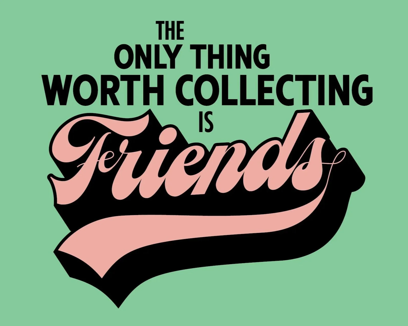
This piece was commissioned for use on stationary cards. The client knew that they wanted the piece to revolve around script, and after some experimenting we settled on this extra-heavy script, which naturally leant itself to a very mid-century color scheme